
Back during Winter Break, I saw Tony Vincent’s Classy Graphics course being advertised online. The six-week course primarily covers graphic design techniques using Google Drawings.
I love making graphics, especially for our school social media accounts to promote school events. I use Canva and sometimes Adobe Spark because the end product looks so professional. However, I know many teachers that are able to design just as beautiful an end product or snazzy up presentations and documents by just using Google products. It’s how Paula Martinez from SlidesMania creates all of her wonderful templates. But I have never felt comfortable enough in my design abilities to do this.
I’m currently in week 4 and this week’s assignment focused on colors and fonts. I learned about some AMAZING sites that give custom color options and also corresponding colors, such as Materialuicolors.co, Materialpalette.com, and uigradients.com. Finding colors that go along well with the main color is usually tricky for me, so I am eager to try some of these out.
We had several options to choose from to complete this week’s assignment and I chose to redo a previous graphic. Back in 2018 when I was producing Season 3 of Tech Tuesday, I designed a graphic to show all of the various URLs you can use to create new Google files.
Here’s the original:
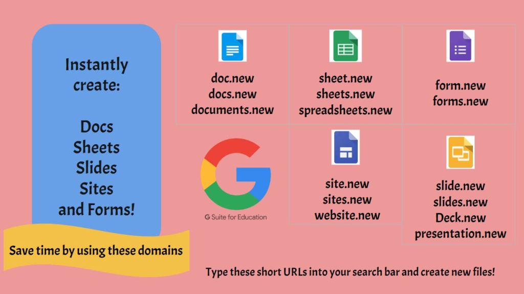
I was never happy with this, but it conveyed the information I wanted.
Then this past August, I developed a professional development session as a sort of refresher on the core G Suite Apps (now Google Workspace) to re-learn new or forgotten features. I dug this graphic out to include in the session, but it needed to be updated with the addition of Jamboard and some new URLs.
So I created a second version:
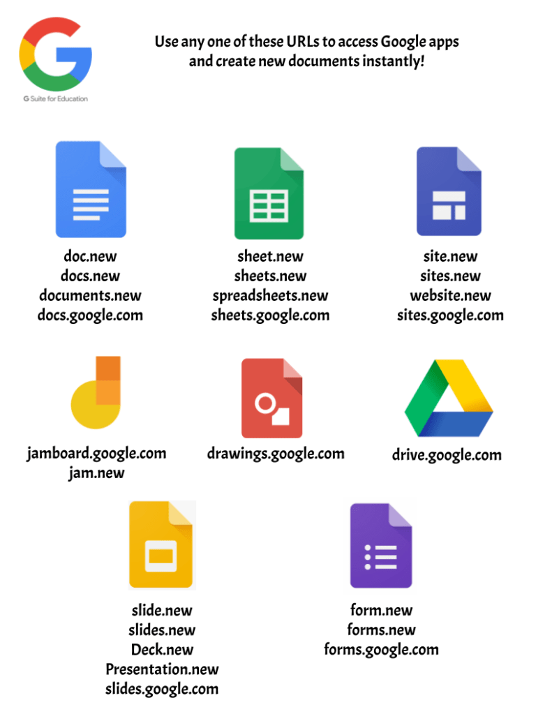
I was much happier with this version as it looked cleaner, simpler, and more professional. But again, I knew I could do better.
On all of the assignments, Tony shares tips for how he designs and one of the tips for this week is that when he creates graphics specifically using Google products, he likes to use the color of that product as the main theme color. For example:

This idea is actually what inspired me to redo my graphic again for a 3rd time. We were given a couple of templates as part of the assignment and I found one that had boxes with a similar organizational system and would fit all of the different Google products. So I made a copy and edited it with the colors I wanted and the information.
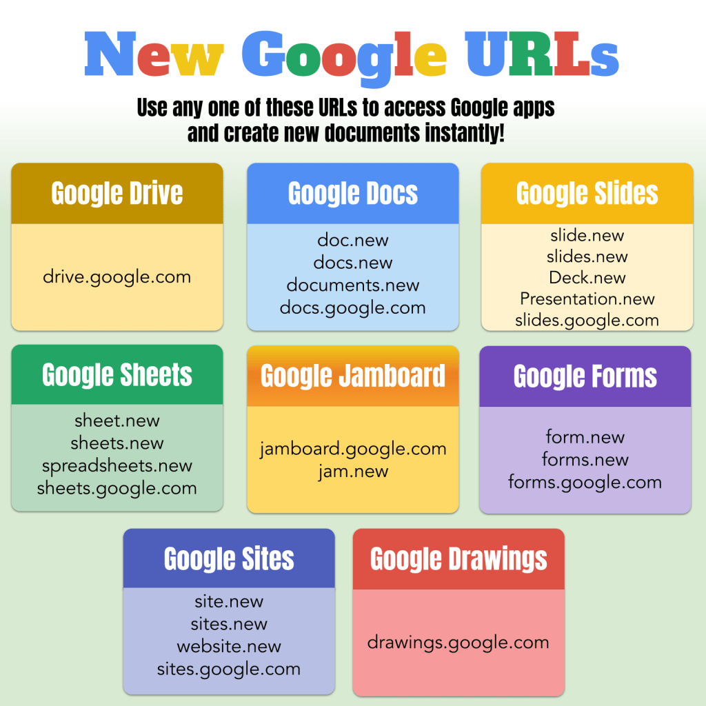
Here’s the 3rd version:
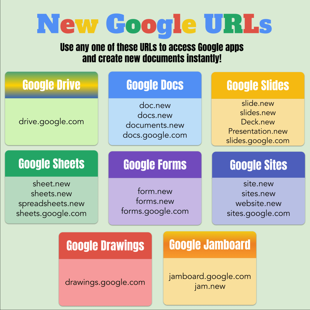
The title matches the colors in the Google logo, while the headers match the colors of the specific Google products. The boxes with the URLs have a lighter matching color.
However, Google Drive and Jamboard threw me for a slight loop because they both have 3 colors in their icons. I thought the gradient color option would be best. Jamboard’s 3 colors are so close it worked to my advantage and created a look with more depth. For Drive, I used the green, blue, and yellow colors from the logo. It wasn’t until later that I realized I used the old logo. The new one has all 5 Google colors in it. I like how fun it looks, but it does feel out of place with the other headers that have solid colors. I think it would look good if all the headers were either gradients or solids, but not a mix of the two.
After submitting the assignment, we write comments on each other’s work with Tony sometimes making a copy of our work to show us other ways we could adapt our designs.
Here’s his version:
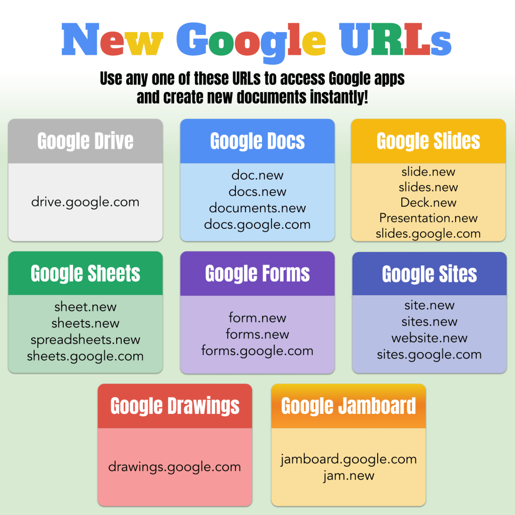
I love how he changed the background from a solid green-gray to a gradient with white at the top behind the title! It really makes the title stand out and the black subtitle text not so depressing looking on an otherwise colorful graphic. He also changed the Google Drive box to gray and then commented that it does look too plain mixed with all the other colors and I agree.
So I played with the design one more time and changed the Google Drive header color to a dark muddy yellow. I figured if you mashed all 5 Google colors together, this is probably what you would get. Then I realized I had 3 boxes in a similar yellow color range and it would be good to move them around the page; which made me realize that the Google Sites and Google Forms boxes, again in similar color ranges were sitting right next to each other!
So here’s the (hopefully) final version:
I’m really glad I took the time to go through this process. I learned some valuable skills and increased my confidence with designing in Google Drawings.

Yup, I can really see the evolution! I should take a graphic design course too. Love it!
LikeLike